
"Getting to design your own book cover is the sort of ultimately maddening power that probably shouldn’t be entrusted to vain mortals," wrote essayist Tim Kreider in the New Yorker a few years ago. "It’s a little like getting to choose your own face." The academics I know have actually tended not to obsess over cover design, in the same way that they tend not to obsess about their daily wardrobe choices. By the time many of us turn to these decisions, we feel like we're up against a deadline and are just anxious to move along. Or we would just rather spend our time on research and writing, tasks that feel more substantial.
I have no real quarrel with that approach. An uninspired cover has never stopped me from reading and appreciating an academic book. But a good cover is such a delight. Done well, a cover helps the reader get in the right mindset, by evoking place, time period, and mood. The covers I most admire are also clever. They visually distill the argument, helping the reader remember the author's main points long after the book has been re-shelved. In other words, cover design isn't, or doesn't have to be, a vanity project. It can be a service to the reader. And even when the ultimate product doesn't quite work (the jury is out on mine), I think that striving to make it work can the author better identify what the book is really about and what readers ought to take away.
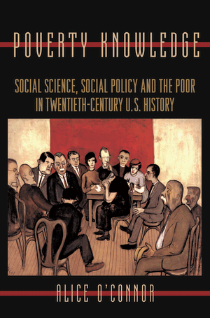 When I began thinking about cover design, I wanted a single piece of artwork to be the focal point. I had in mind the paintings and murals on books like Alice O'Connor's Poverty Knowledge (right), Mark Brilliant's The Color of America Has Changed, Nancy MacLean's Freedom Is Not Enough, and, of course, my co-blogger Dan Ernst's Tocqueville's Nightmare. For photographs, I thought about the evocative images on the covers of A Movement Without Marches, by Lisa Levenstein, and Sweet Land of Liberty, by Tom Sugrue. (Another great use of a photograph, which I saw for the first time a few days ago, is the cover of Dan Bouk's How Our Days Became Numbered.)
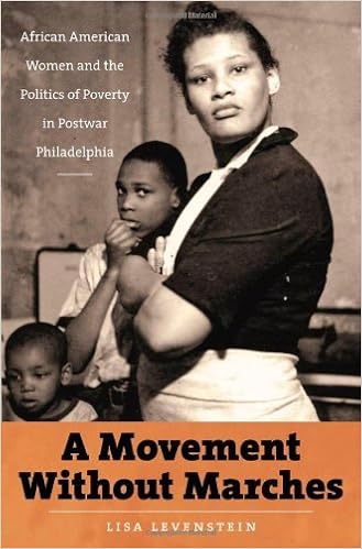
I spent a lot of time looking for the right image, mostly using online resources. Surely, I thought, I would find something in the bountiful prints and photographs collection of the Library of Congress, or on the website artsy, a searchable database of images from numerous museums and galleries (hat tip there to my art historian sister, Ellen Tani). But nothing seemed quite right.

Similarly, the book is about rights, but not about flashy court battles or dramatic public protests. The rights I am interested in unfurled slowly, in the everyday work of government bureaucrats and the case-by-case elaborations of poor claimants. Think rows of file cabinets rather than the March on Washington -- not exactly a sexy visual. (Kudos to Joanna Grisinger for making file cabinets work for her on the cover of The Unwieldy American State (right, at the bottom of the pyramid).)
Another major theme of the book is changes in the practices of federalism, specifically, the dramatic rise in federal-to-state grants-in-aid and the ripple effects of those grants. I struggled to think of a single image that could capture these abstract policy devices and their diffuse consequences.

 Another decision we made was to layer the
images over an outline of the United States (similar to the cover of Margot Canaday's The Straight State (right), a book I really admire). I hoped that this visual effect would encourage readers (1) to see the story as a national one, and (2) to reflect on the multiple uses of the word "states" in the title. As I use it, the word "states" refers (a) to the states that comprise the United States, (b) to different iterations of "the state" (that is, to sequentially unfolding regimes of governance in American history), and (c) to multiple ways of being--in this case, of being dependent. As I write in my introduction, the book is about "the dependency of citizens on government and
government on citizens; the dependency of the federal government on state and
local administrators, and of state and local governments on federal dollars;
the dependency of the poor (especially women, children, and racial minorities)
on their wealthier neighbors; [and] the dependency of these wealthier neighbors on
the state, to create and protect what they claim as theirs."
Another decision we made was to layer the
images over an outline of the United States (similar to the cover of Margot Canaday's The Straight State (right), a book I really admire). I hoped that this visual effect would encourage readers (1) to see the story as a national one, and (2) to reflect on the multiple uses of the word "states" in the title. As I use it, the word "states" refers (a) to the states that comprise the United States, (b) to different iterations of "the state" (that is, to sequentially unfolding regimes of governance in American history), and (c) to multiple ways of being--in this case, of being dependent. As I write in my introduction, the book is about "the dependency of citizens on government and
government on citizens; the dependency of the federal government on state and
local administrators, and of state and local governments on federal dollars;
the dependency of the poor (especially women, children, and racial minorities)
on their wealthier neighbors; [and] the dependency of these wealthier neighbors on
the state, to create and protect what they claim as theirs." A final detail that I thought about was the font. I sent the designer samples of my primary sources for inspiration. I like the typewriter-ish font that he chose because it suggests bureaucracy. Government bureaucrats are key actors in my story and their copious internal records informed much of my research. The font, in other words, matches one of my big methodological claims: that legal historians of the twentieth-century U.S. must find ways to access and analyze the work of administrators. In the "age of statutes," administrators were vital problem solvers, decisionmakers, and connectors. Working quietly and away from the flashbulbs of the press, they were also often agents of change.
Readers, what is your experience with cover design? What covers do you particularly admire and why? Do you have advice to share? We would love to get a conversation going in the comments.